The Releases list and the release screen
Almost everything you do in the app happens on one of two screens: the Releases list — every release in your workspace — and the release screen you open from it, which shows one release in full detail. This article is a tour of both. By the end you'll be able to open any release and read, at a glance, who is working on what, what's ready to pick up, what a review flagged, and how far a deploy has gotten.
Everything on these screens is the shared record: one copy that every person and every machine reads from and writes to. You're never looking at a private, local view that has quietly drifted from what a teammate sees — you're looking at the same record they are.
#The Releases list
The Releases list is the first thing you see when you open the app. It's the home for your workspace: one card per release, newest work surfaced first.
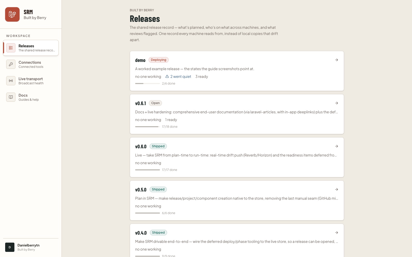
Each card gives you the shape of a release without opening it:
- Version and phase. The release's name (for example
v0.6.1) and a colored badge for where it sits on its journey — Planning, Open, In progress, In review, Wrapping up, Deploying, or Shipped. - Theme. A one-line description of what the release is about.
- Live work across machines. The line that only this app can show you: how many work items are being worked right now, and across how many machines. If someone picked up a task and then went quiet, you'll see a "went quiet" note here too. And a count of how many items are ready to pick up.
- Progress. A quiet bar showing how many work items are done out of the total.
Click any card to open its release screen.
If the list is empty, no releases have been created in this workspace yet. A release is created by your team's release tooling; once one exists, it appears here automatically.
#Anatomy of the release screen
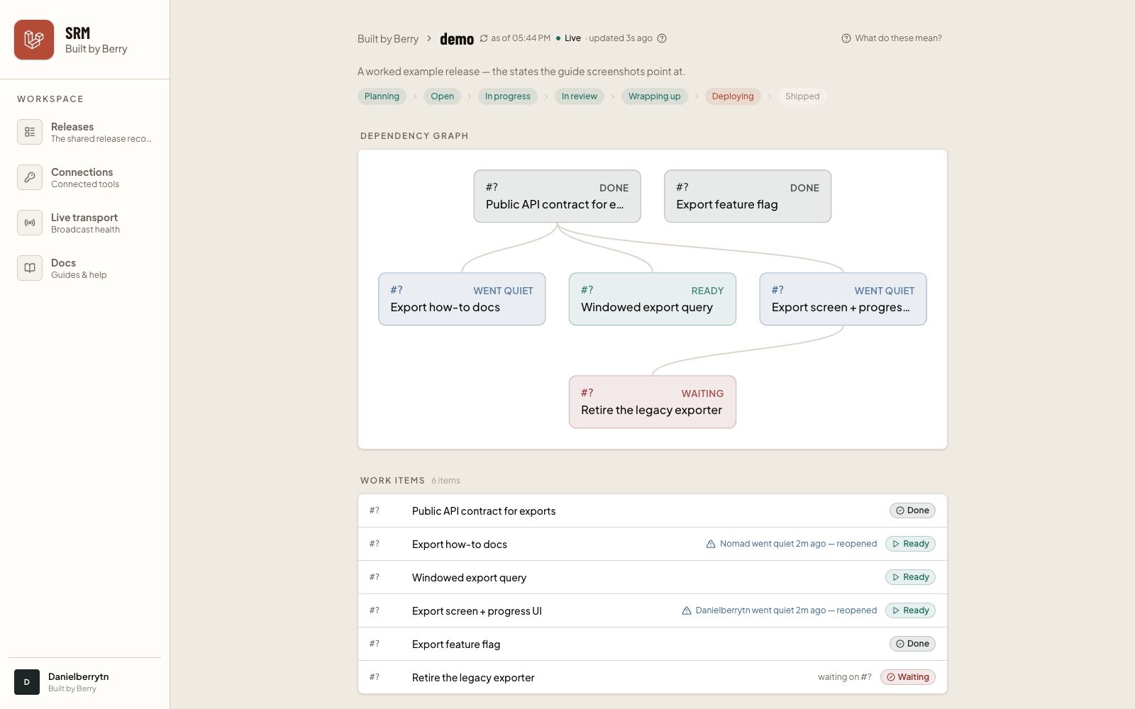
Opening a release takes you to its detail screen. It's a single, scrollable page, read top to bottom: the header and phase strip first, then the dependency graph, the work items, any active dispatch waves, review findings, and finally the deploy. Let's walk through each region.
#The header
At the top you'll find your workspace name (a link back to the Releases list), the release version, and the release's theme.
Two controls sit next to the version:
- "as of 3:42 PM" — a small clock-and-refresh control. It tells you the moment the screen last pulled fresh data from the shared record, and clicking it pulls the latest right now. (When live updates are on — see the very end — this refreshes on its own as changes happen.)
- "What do these mean?" — opens a plain-language glossary. Everywhere the app uses a friendly word, the precise technical term is in parentheses for anyone who wants it. If a label on the screen is ever unclear, this is the place to look.
#The phase strip
Just below the theme is a strip of the release's phases, laid out left to right in the order a release travels through them:
Planning → Open → In progress → In review → Wrapping up → Deploying → Shipped
Phases already behind are tinted green (complete), the current phase is highlighted, and phases still ahead are greyed. It's the one-glance answer to "where is this release overall?"
If the release is linked to an issue tracker (GitHub, Linear, or Jira), a "View milestone in tracker" link appears here too.
#The dependency graph
Next is a map of the release's work items and how they depend on one another. Items are drawn in layers: blockers on top, the work that depends on them below, with lines connecting a blocker down to everything it's holding up.
This is how you see, at a glance, what can happen in parallel and what has to wait. An item at the top with nothing above it can be started immediately; anything with a line coming into it from above has to wait for the item that line comes from.
Each node is colored by its current status — the same status language used everywhere else on the screen (see the next section). A node shows its reference number, its status, and its title.
#Work items and their states
Below the graph is the work items list — every task in the release, one row each. This is the heart of the screen, so it's worth learning to read a row.
Each row shows a reference number, the item's title, and a status pill on the right. The pills are:
- Ready (green, play icon) — every prerequisite is finished, so this can be picked up next.
- Working (rust, clock icon) — someone (a person or an agent) is on this right now.
- Waiting (red, blocked icon) — waiting on other work items to finish first. The row also spells out what it's waiting on ("waiting on #12, #15").
- Needs setup (grey, "?" icon) — this item's dependencies haven't been confirmed yet, so the app can't tell whether it's ready.
- Done (dark, check icon) — merged and complete. This is final.
#Claims and who's holding what
When someone is actively working an item, that row shows who has it — their name and avatar, the machine they're on, and a small "beat 4s ago" note. That "beat" is a heartbeat: proof the holder is still active. A fresh heartbeat shows a green dot; if it's been a little while, the dot turns blue.
This is the app's answer to "is anyone already on this?" — you can pick up ready work without stepping on a teammate, because you can see, live, exactly what's held.
When a holder goes quiet. If someone claimed an item and then stopped checking in (they closed their laptop, lost their connection, or the work stalled), the app notices and reopens the item automatically so it doesn't sit stuck under a hold that no longer exists. The row shows a "went quiet … reopened" note, and the item becomes takeable again. Nothing is lost — the item simply returns to the pool for anyone (including the original holder) to pick back up.
#Dispatch waves
When several ready items are picked up together as a batch — a dispatch wave — a monitor appears showing that wave's live progress. Each wave lists its members (the work items in the batch) and, for each, a status that moves along Dispatched → In progress → Proposed → Done (or Failed). Under each member you'll often see a short "last progress" note describing what's happening right now.
At the top of each wave is a running tally — "3/6 done" — and a set of small counters summarizing how many members are in each status. This is the screen to watch when a group of tasks is being worked in parallel; with live updates on, the members advance in place as the work happens, no refresh needed. (If no wave is active, this section simply isn't shown.)
#Review findings
Below the waves is Review findings — anything a change review or a readiness check flagged. Each finding shows its reference, what kind of review raised it (Change review, Readiness, or Design), a severity (high findings are tinted red, medium blue, low grey), which work item it relates to, and a short summary with optional detail.
Findings stay Open until they're resolved; a resolved count ("+ 3 resolved") appears at the bottom once some have been handled. If nothing has been flagged, you'll see a reassuring "Nothing flagged by review or readiness yet."
Findings are how the release surfaces its own quality gates: an open high-severity finding is a signal that something needs attention before the release ships.
#The deploy
The last region is the Deploy — the story of the release going live. Before a deploy starts you'll simply see "Not deployed yet." Once it begins, a pipeline strip appears, laid out in order:
Merging → Deploying → Smoke-testing → Monitoring → Shipped
Like the phase strip, completed steps are green, the current step is highlighted, and upcoming steps are greyed.
Beneath the strip is the evidence behind each step: the merged commit and who merged it, whether smoke tests passed or failed, and — during monitoring — how many checks ran over how long a window. When it's done you'll see a green Shipped headline and a "View deployed release" link.
If a check fails after the release is live, the panel turns to a "Rollback needed" banner: the release is up, but something failed and a person needs to decide whether to roll it back. It's deliberately loud — this is the one state on the screen that asks for a human decision.
#The ● Live indicator
You may have noticed a small status dot in the header — ● Live. It tells you how fresh what you're looking at is: whether the screen has an open, instant connection to the app or has quietly fallen back to refreshing on a timer.
- ● Live (green) — connected; changes stream in the moment they happen.
- ● Reconnecting (amber, pulsing) — a brief hiccup; the app is restoring the connection and still refreshing on a timer in the meantime.
- ● Stale (grey, pulsing) — the instant connection is down for now, so the screen refreshes periodically instead; it reconnects on its own.
Whichever state you're in, what you see is always accurate — the shared record is the source of truth and the screen always reflects it; the only difference is whether updates arrive the instant they happen or a few seconds later on the next check. Next to the dot, "updated 4s ago" tells you how long since the last refresh. For the full explanation, see Understanding the Live indicator.
The live layer is what makes everything above feel alive: work items flip from Ready to Working as teammates pick them up, holders' heartbeats tick, dispatch members advance, findings resolve, and the deploy pipeline moves — all without you touching the page.